
Where are all the people?
Students in MYP 3 are currently learning about patterns of population change around the world, a field of study known as population dynamics. Specifically, students are (1) finding out about how the world population has changed over time and which processes allow this to happen, (2) exploring different ways of modelling population change and looking at case studies of social issues in different societies due to these changes, and (3) creating infographics to teach others about the population dynamics of a given country.

What is population dynamics?
“Population dynamics is the study of how and why populations change in size and structure over time. Important factors in population dynamics include rates of reproduction, death and migration.” (Source). Population dynamics includes the study of important concept, such as:
- Birth rate
- Death rate
- Infant mortality rate
- Population growth rate
- Life expectancy
- Migration (including immigration and emigration)
- Overpopulation
- Population pyramids
- Demographics
Population pyramids, for example, are a great way of visually representing the population of a country. Population pyramids show the percentage (%) of the population of a country that is either male or female and what age group they are in. Population pyramids serve to provide an overall understanding of population structure, as well as to predict how the population might change in future years (i.e., ageing population vs. declining population).

How will students be assessed?
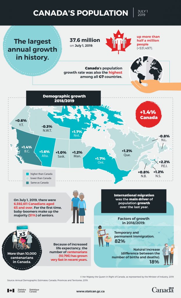
To demonstrate their understanding of population dynamics, as well as to learn a new skill, the summative assessment for this unit is to create an infographic. The infographic should include important information about the population of a country of the student’s choice. The infographic should include statistical information on the country’s population size, birth rate, death rate, life expectancy, and so on. It should also include a map, a population pyramid, and relevant images and graphs to to reflect the country’s population structure. The infographic should also aim to answer the following questions:
- What are the reasons for the country’s current population structure?
- Are there any issues for the country with the existing population structure (e.g., ageing population, declining population, or overpopulation)?
- What solutions or suggestions would you recommend for the government to help the country develop in the future?
Why make an infographic about it?
“An infographic is a collection of imagery, data visualizations like pie charts and bar graphs, and minimal text that gives an easy-to-understand overview of a topic.” (Source). Here are some reasons why it is a good idea to use them:
- They are a valuable tool for communicating information in a visually appealing way
- They are an effective way to grab someone’s attention
- Creating them teaches students valuable skills related to design, marketing, communication, formatting, and general technological proficiency
- They are a fun way to learn and teach others about interesting topics!
Next month I will post a follow-up blog showcasing some of the infographics that students made! 🙂