Make Visual Texts Your Strength for Paper 1
Paper 1 in DP Language & Literature is a guided analysis of previously unseen non-literary texts. At SL you choose one of two; at HL you analyse both—always non-literary, often drawn from everyday media. Success comes from showing clear understanding of the text, naming the choices a creator makes, explaining their effects on a specific audience and purpose, and presenting your ideas in a clean, purposeful structure. That’s why visual texts can be a gift: their techniques are visible on the page—composition, placement, colour, type, iconography, scale, axis choices—so you can point, name, and argue cause→effect→meaning in a way the Paper 1 criteria reward. Learn to read visual texts.
How common are visuals? While the IB doesn’t publish percentages, the official course materials and widely used teacher exemplars make it clear that visual and multi-modal texts are regular, expected fare. Sample and specimen sets frequently include things like a cartoon, an advertisement, an editorial, or a public appeal, and many teacher-facing overviews note that at least one text often carries a strong visual component. In short: you should absolutely be prepared for ads, infographics, webpages, and cartoons—and you’ll be rewarded for analysing them precisely.
So, when you meet a visual in Paper 1, read it exactly the way the paper wants to be read: state purpose and audience up front, then track method → effect → meaning through specific features (for an ad: crop and salience; for an infographic: hierarchy and honest/biased scale; for a cartoon: caricature and caption irony). Finish by articulating the viewpoint the text constructs for its audience. That’s the Paper 1 brief—and visuals are built to let you meet it.
Paper-1-ready checklists by text type
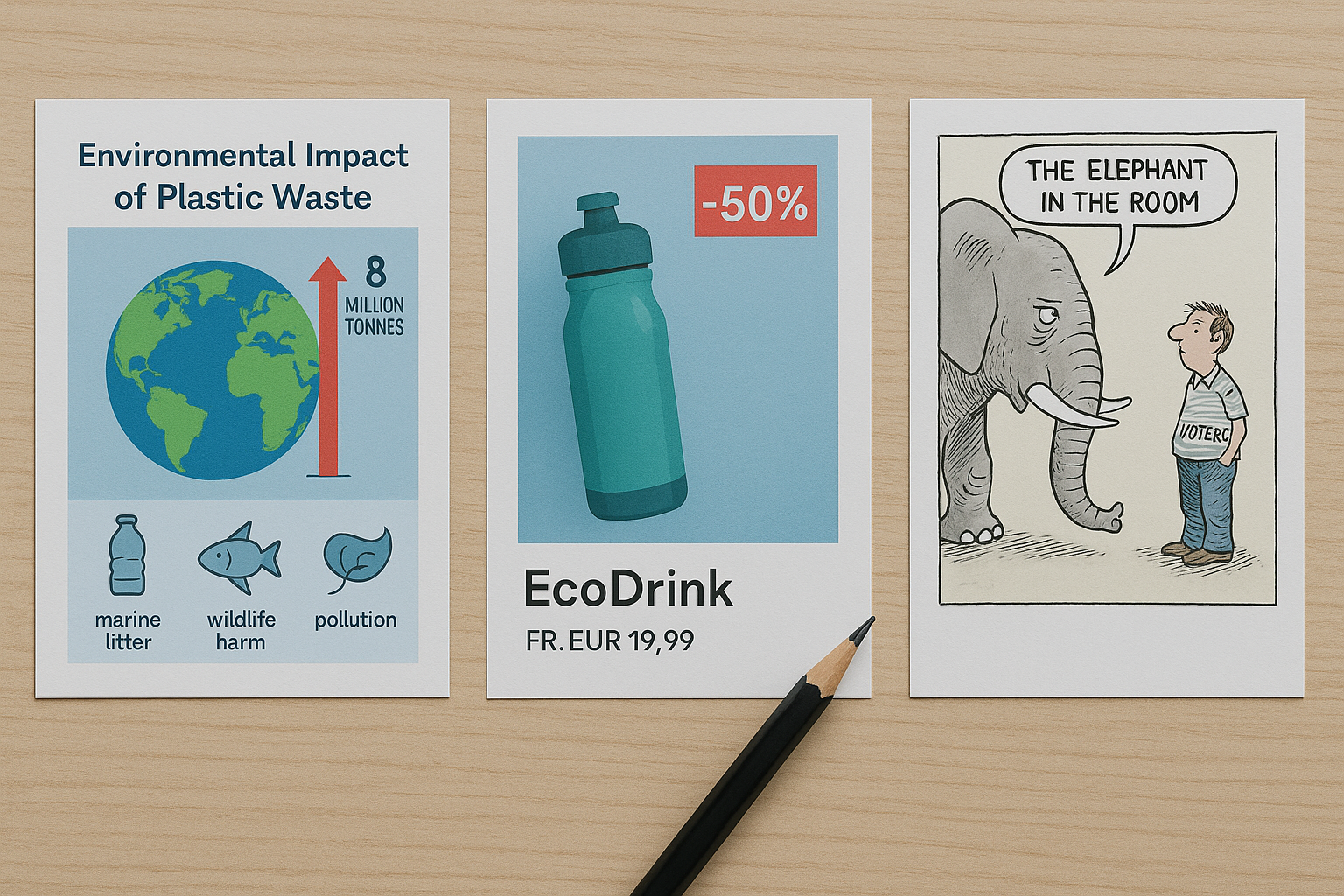
Ads (print/social)
-
Salience & placement: What the eye hits first (size/contrast); top vs bottom, left vs right (given/new).
-
Brand & value blend: Performance + ethics? Luxury + simplicity? Which choices build that blend?
-
Copy & type: Imperatives, superlatives, modal verbs; sans vs serif; caps vs lowercase.
-
Proof moves: Logos (stats), ethos (endorsement), pathos (imagery).
Infographics
-
Data integrity: Axes starting at ≠0, inconsistent units, misleading area/3D effects.
-
Hierarchy: Title → framing stat → chart/diagram → source/credibility line.
-
Chunking & icons: How visual grouping shapes what seems important/true.
-
Source & trust: Who made it? What interest do they have?
Editorial cartoons
-
Caricature & symbolism: What’s exaggerated? What stands in for what?
-
Caption & irony: Reframed slogans, footnotes, labels.
-
Spatial metaphors: Up/down (power/failure), inside/outside (belonging), scale (importance)
SL and HL Responses
For SL, think of your response as a short, purposeful arc. Open with two or three sentences that locate the text for your reader: name the text type, state its purpose and intended audience, and offer one clear organizing claim about how the design achieves that purpose. From there, move through two or three body paragraphs. In each one, stay inside a single “visual system”—composition, or typography and copy, or color/iconography/data—and unpack two or three specific choices from that system. Don’t narrate what’s visible; trace the chain from method to effect to meaning. By the time you reach your final lines, you should be able to articulate the world-view the text constructs and why that view would appeal to the audience you named at the start.
For HL, the shape is similar but adds a comparative layer. Begin by introducing both texts and announcing a comparative idea that does more than say “both are about X”; aim for something like, “Both normalize X, but Text A leans on a cropped ‘hero’ image while Text B relies on a crowd from a bird’s-eye perspective, positioning readers differently.” Give each text its own space first—one paragraph for A, one for B—so you can analyse them on their own terms without ping-ponging sentence by sentence. Then write a dedicated comparison paragraph where you place methods side by side: if A’s tight crop individualizes and B’s aerial view collectivizes, say so and explain how those choices shift audience positioning. Close by stating what the comparison reveals about purpose, audience, and stance that you couldn’t have seen if you’d read the texts in isolation.
Across both levels, a simple time split keeps you on track: spend roughly a fifth of your time planning (selecting the most revealing choices and the order you’ll use), about seventy percent drafting your analysis, and the final ten percent tightening topic sentences, transitions, and phrasing so every claim travels cleanly from purpose → audience → choices.